When we talk about the culture of an organization, we refer majorly to the internal policies related to employee benefits, working hours, dress code, hierarchy in the organization and others. But, if we dive deep to understand the core, it is the distinct culture of an organization that plays a pivotal role in its journey towards the acme. And this comes with a great sense of motivation among the employees and other stakeholders.
For any successful organization, branding has always been one of the most crucial front as it conveys the latent message behind the mission & vision statement, the core values of the organization and the underlying culture. If we look at any successful organization, we would see that their brand and culture are perfectly aligned and are integrated so as to strengthen its sustainable competitive advantage, and fuel growth. Their leaders understand impeccably that a progressive, growing culture contributes to a progressive, growing brand – and an extraordinary brand reflects the actual sense of an extraordinary culture.
This article aims at discussing the learning from one such organization, which has achieved a remarkable position in the industry with an innovative culture, and we will see how their branding support them at each level with an example of their logo design.
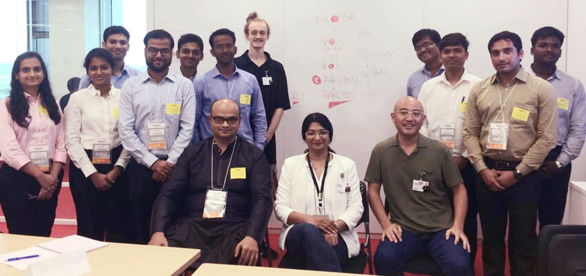
 As part of the International Immersion Program at IIM Nagpur, we recently visited the Rakuten headquarters in Tokyo. We were privileged to have an insightful discussion with Mr Masatada ‘Seichu’ Kobayashi (Seichu San), co-founder and Chief Well-Being Officer, Rakuten and Nalini George, Chief People Office, Rakuten India on the cultural changes that Rakuten has seen in the last decade, and how it has impacted the organization. One of the most critical aspects of the discussion revolved around the importance of branding in a company’s life-cycle, especially when the organization is going through diversification and rapid growth globally. Below given are the key pointers about the evolution of Rakuten’s logo and how it was in sync with the growth strategy of the organization.
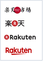
The first brand of Rakuten group was Rakuten Ichiba, an e-commerce platform. The inspiration was taken from Rakuichi-Rakuza, Japan’s first free and open marketplaces from the Azuchi-Momoyama period (1573-1600), with the objective of creating a sense of bright future and ‘optimism’ – as the word ‘Rakuten’ means in Japanese.
Initially the logo was designed to reflect how company focuses on the empowerment of the local merchants. It was conveyed by the red circle representing the Sun, taken from the national flag of Japan. It communicates the message that Japan is “The land of the rising sun”, and hence it builds a connection with the native culture of Japan and conveys the firm’s values of empowerment through innovations.
With the focus on globalization along with maintaining the native culture, Rakuten came up with a new elegant logo, with “R” shown inside the red circle. It reflected the transition phase, as portrayed by the logo in English language along with the red circle representing the sun.
The current logo with a motif based on the Japanese character for “one” or “ichi”, reflects the vision of Rakuten group as a unified business group with multiple businesses encapsulated within one culture and value system. This logo is also aligned to the minimalist design principles, that becomes a crucial factor when an organization is expanding globally.
We also had a discussion on how Rakuten started an initiative, “Englishization”, under which English became their official business language. Now, this is a major shift for an organization of this scale, and needs enormous effort internally within the organization. But, with their dedication and determination in the last few years, they have achieved this goal with immense success, and today, Rakuten takes pride in claiming its position as a global player in internet-based products and services industry.

